19 Common Front Yard Features That Secretly Give Garden Designers The “Ick”
Ever wonder what makes garden designers wince as they pass certain homes? It’s not always obvious—what seems charming to homeowners might be unintentionally clashing or outdated.
Common culprits include cluttered yard ornaments, mismatched edging materials, or oversized shrubs that block windows. These features may feel cozy or fun at first, but pros see how they interrupt flow and diminish visual harmony.
Want to wow instead? Designers favor clean lines, layered plantings, and thoughtful focal points that guide the eye. It doesn’t take a full overhaul—just smart tweaks that turn “what were they thinking?” into “why didn’t I think of that?”
1. Plastic Edging That Pops Up
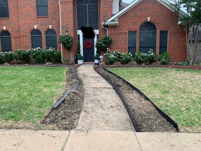
Those black plastic borders might seem like an easy solution for separating garden beds from lawn areas. Over time, they inevitably heave upward, creating trip hazards and exposing their artificial nature.
Freezing and thawing cycles push them out of the ground each year. What starts as a clean edge quickly becomes a maintenance headache that looks increasingly shabby with exposure to UV rays.
Consider natural stone borders, steel edging, or even a simple spade-cut edge that can be refreshed seasonally instead. These alternatives age gracefully rather than becoming eyesores.
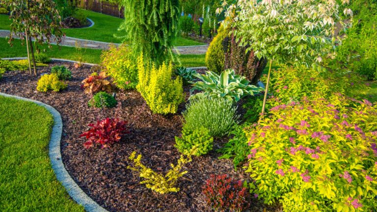
2. Rainbow Of Annual Flowers Without Structure
The garden center’s spring display is tempting, but purchasing one of everything creates visual chaos. Without a thoughtful color scheme or structural elements, these colorful annuals create a disjointed, carnival-like appearance.
The lack of repetition prevents the eye from resting anywhere specific. Garden designers know that even colorful plantings need visual breathing room and a sense of intentional design.
Choose three complementary colors and repeat them throughout beds for cohesion. Add evergreen shrubs or ornamental grasses to provide year-round structure that anchors seasonal color.
3. Scattered Concrete Animal Statues

The random collection of concrete critters—frogs, rabbits, and turtles—scattered throughout the front yard creates a disjointed feeling. Each addition might seem charming individually, but the cumulative effect reads as cluttered and thematically confused.
These mass-produced items often fade unevenly and collect algae in ways that highlight their artificial nature. Professional designers prefer focal points that complement the architecture and planting style.
If you love garden art, choose one significant piece that makes a statement rather than creating a concrete menagerie that distracts from your plantings.
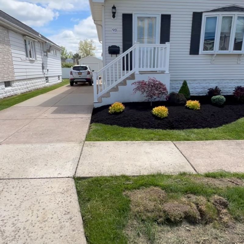
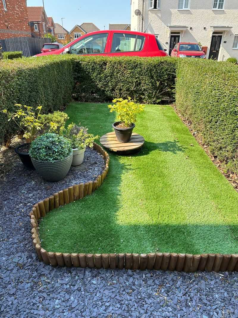
4. Perfect Circle Mulch Rings Around Trees
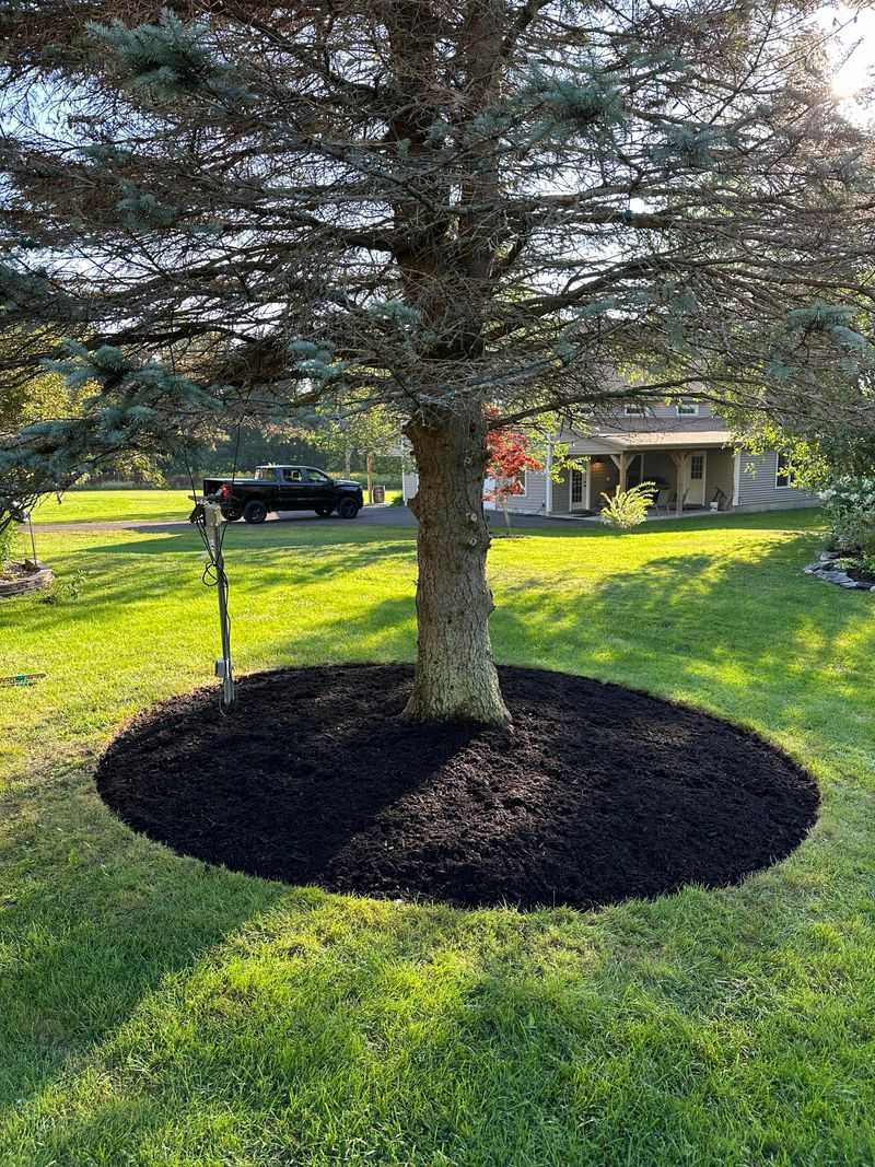
Those perfectly circular mulch rings surrounding individual trees make designers wince. The rigid geometry looks unnaturally imposed on the landscape, creating disconnected “mulch islands” floating in a sea of grass.
Maintaining these perfect circles requires constant edging while creating maintenance challenges for mowing. Natural landscapes don’t feature perfect circles, which is why these rings immediately signal an amateur approach.
Instead, create flowing, connected planting beds that incorporate trees into the overall landscape design. This approach looks more natural while reducing mowing and creating opportunities for complementary plantings.
5. Volcano Mulching
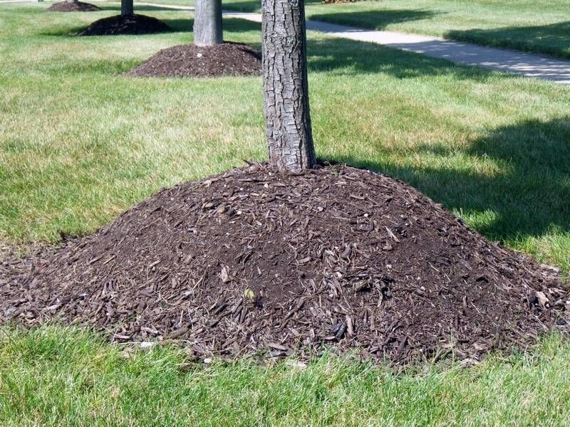
Piling mulch high against tree trunks is a widespread practice that makes professional landscapers cringe. This “volcano” approach traps moisture against bark, inviting decay, fungal diseases, and insect infestations that can ultimately kill trees.
The practice often stems from watching maintenance crews who prioritize using up mulch quickly over proper tree care. Healthy trees need their root flares exposed to air, not buried under mountains of wood chips.
Apply mulch in a flat, even layer 2-3 inches deep, keeping it pulled back several inches from the trunk. Think “donut,” not “volcano,” when mulching around trees.
6. Railroad Tie Retaining Walls
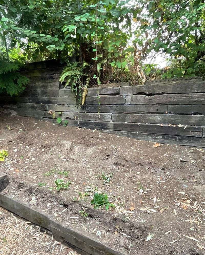
Once popular in the 1970s and 80s, these creosote-treated timbers haven’t aged well in residential settings. The chemical treatments used to preserve these industrial materials can leach into soil, potentially harming plants and contaminating groundwater.
Beyond environmental concerns, railroad ties typically warp, separate, and create uneven walls over time. Their dark, heavy appearance often overwhelms residential landscapes, creating a visual weight that pulls focus.
Modern alternatives like segmental retaining wall blocks, natural stone, or even steel offer cleaner lines, better longevity, and more environmentally friendly options for necessary grade changes.
7. Randomly Placed Boulder Rocks
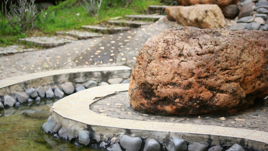
The “plop and drop” approach to landscape boulders makes designers quietly shake their heads. When large rocks appear to have fallen randomly from the sky with no relationship to topography or plantings, they look distinctly unnatural.
Natural stone arrangements follow geological logic—they appear partially buried, grouped logically, and oriented consistently. Stones in nature don’t sit perched on flat ground like eggs on a table.
For natural-looking stone features, bury about a third of each boulder’s height, position them in odd-numbered groupings, and orient their most attractive faces consistently. This creates the impression they’ve been there forever.
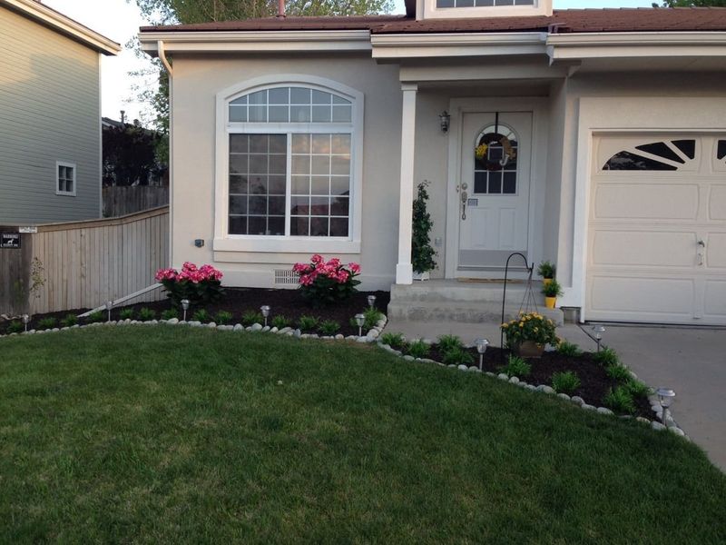
8. Straight-Line Foundation Plantings
The single row of identical shrubs marching in a perfect line along the house foundation screams outdated design thinking. This approach, popularized in the 1950s, was originally intended to hide unsightly foundations but creates a static, unimaginative boundary.
Modern homes rarely need this foundation camouflage, yet the practice persists. The regimented appearance feels institutional rather than welcoming and fails to create visual interest throughout changing seasons.
Consider layered planting beds with varied heights, textures, and seasonal interest that extend outward from the house in curved beds. This creates depth and draws the eye through the landscape rather than creating a green wall.
9. Artificial Flowers In Garden Beds
The attempt to cheat nature with plastic blooms tucked among real plants creates a jarring visual disconnect. These fade-resistant impostors stand out even more as surrounding plants naturally change with the seasons.
Their colors typically appear too bright or slightly off compared to nature’s palette. The unchanging perfection signals artificiality from a distance, undermining the authentic beauty of real garden elements.
Embrace the natural cycles of real plants instead. For year-round color, incorporate plants with interesting bark, berries, or seed heads that provide winter interest without resorting to plastic substitutes.
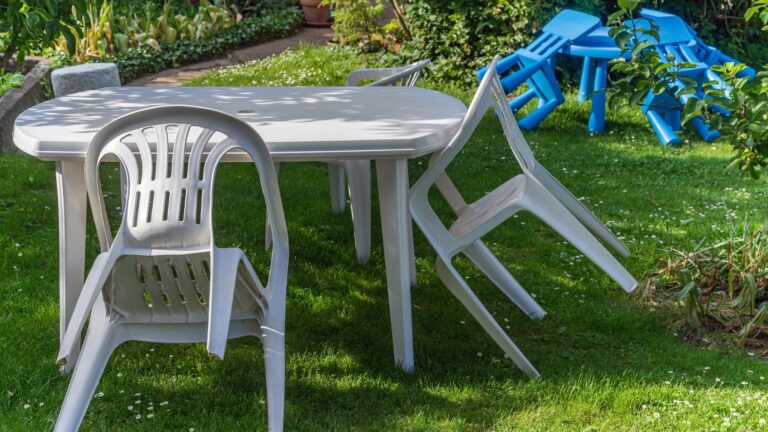
10. Excessive Lawn Ornaments
The collection of windmills, wishing wells, and whirligigs accumulated over years creates a cluttered carnival effect rather than a cohesive landscape. Each item competes for attention, preventing any single element from becoming a meaningful focal point.
Many mass-produced decorative items lack proportion relative to the landscape, appearing either too small or oddly scaled. Professional designers know that restraint creates more impact than accumulation.
Select one or two quality pieces that complement your home’s architectural style and landscape theme. Position them where they enhance the overall design rather than creating a distracting obstacle course.
11. Dyed Mulch In Unnatural Colors
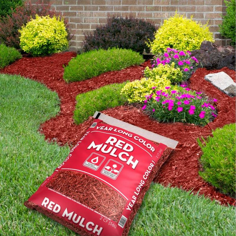
The bright red or jet-black dyed mulches immediately signal artificial intervention in what should feel like a natural setting. These highly processed products contain dyes that can leach into soil and fade unevenly, creating a spotty appearance over time.
The unnatural coloring draws attention to the mulch itself rather than highlighting the plants. Garden designers prefer materials that complement plantings rather than competing with them for visual attention.
Natural bark mulches, compost, or pine straw provide the same weed suppression and moisture retention benefits while blending harmoniously with the landscape. Their subtle coloration creates a better backdrop for showcasing plants.
12. Mismatched Planting Containers
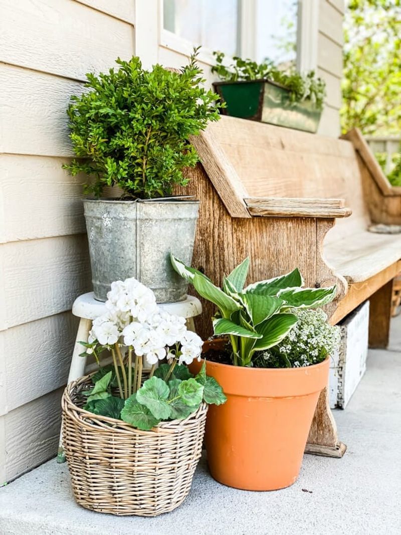
The random assortment of pots collected over years—plastic nursery containers, ceramic planters of various colors, and decorative vessels with competing styles—creates visual chaos rather than cohesion. Scale inconsistencies compound the problem when tiny pots sit alongside oversized containers.
Container gardens should enhance architectural elements and planting schemes, not distract from them. Professional designers select containers that complement both the home’s style and each other.
Choose containers with a consistent material, color family, or style theme. Group them in odd numbers and vary heights for interest while maintaining a visual relationship between all container elements.
13. Bed Edging With Upturned Glass Bottles
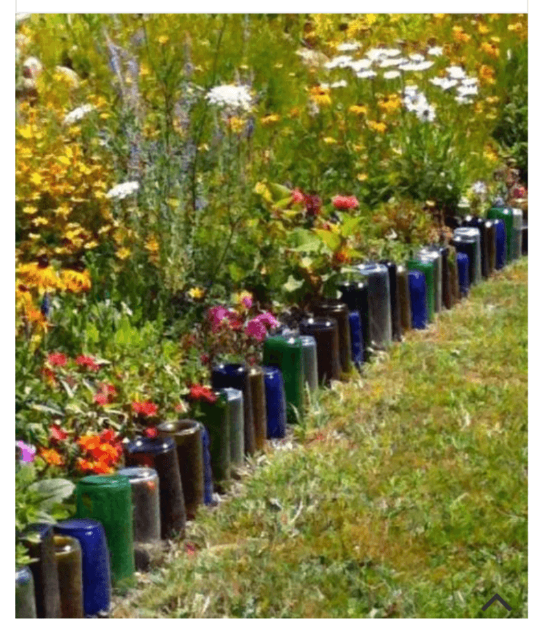
The practice of embedding wine or beer bottles upside-down as garden bed borders falls firmly into the DIY territory that makes professionals cringe. While recycling is admirable, these makeshift borders create uneven lines that collect debris and complicate maintenance.
The bottles typically work their way loose over time, creating hazards and requiring constant adjustment. The colors and labels often clash with plantings rather than enhancing them.
For eco-friendly edging alternatives, consider locally sourced stone, reclaimed brick, or even clean-lined steel edging that provides definition without the visual distraction of consumer packaging.
14. Hodgepodge Of Solar Lights
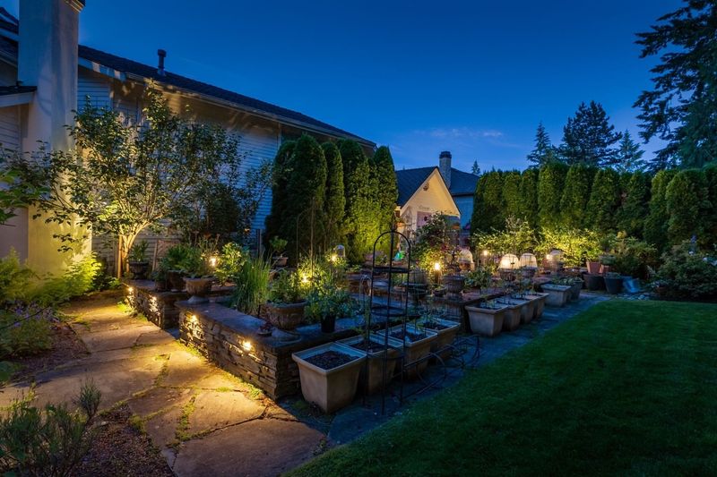
The collection of mismatched solar stake lights lining walkways and dotting garden beds creates a confusing nighttime airport runway effect. During daylight hours, these plastic fixtures look particularly out of place, detracting from the natural landscape.
Cheap solar lights typically provide inconsistent illumination as batteries degrade at different rates. The result is a spotty lighting scheme that fails to highlight landscape features effectively.
Consider fewer, higher-quality landscape lighting fixtures that serve specific purposes—illuminating paths for safety, highlighting architectural features, or showcasing specimen plants. Quality lighting creates ambiance rather than visual clutter.
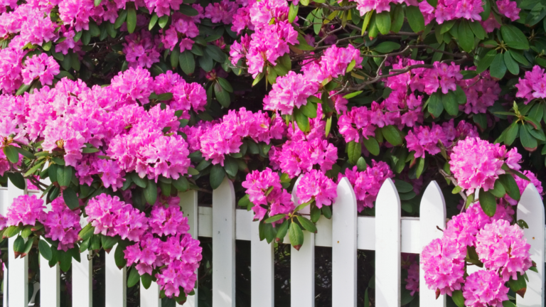
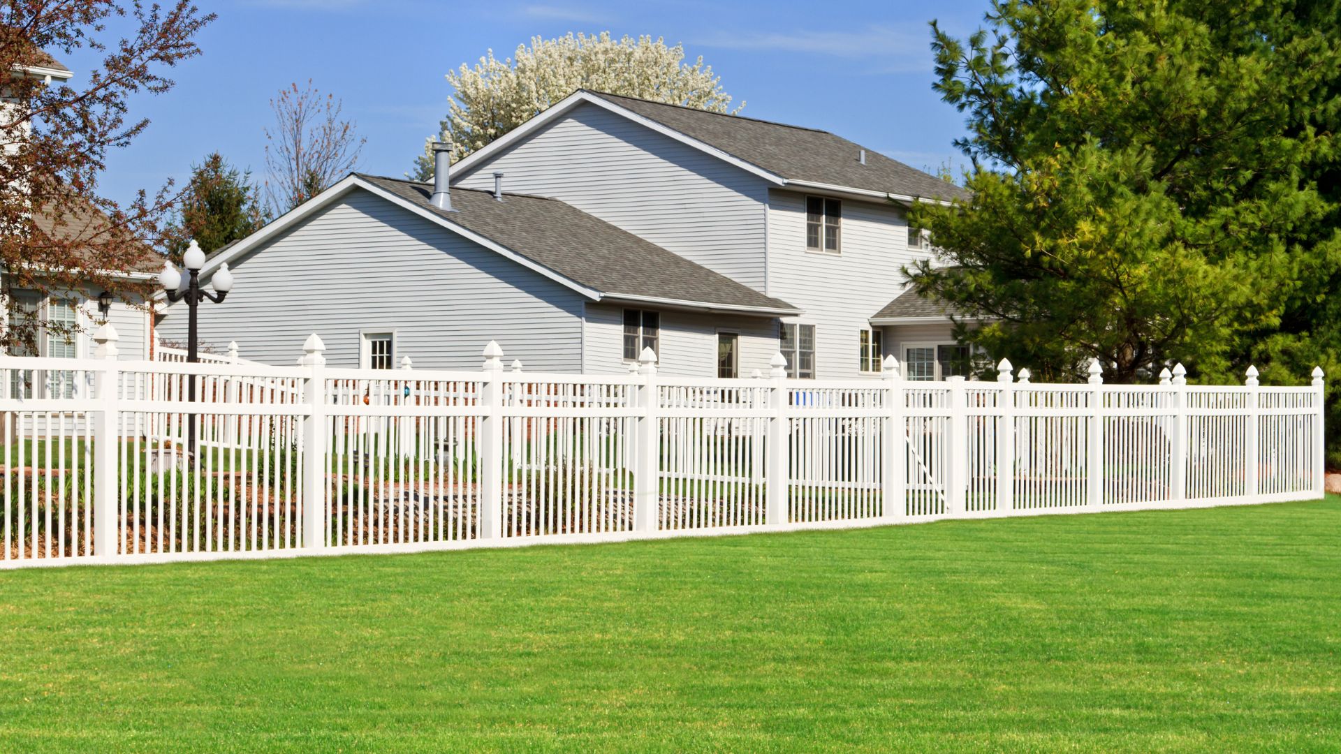
15. Plastic Fencing That Mimics Wood
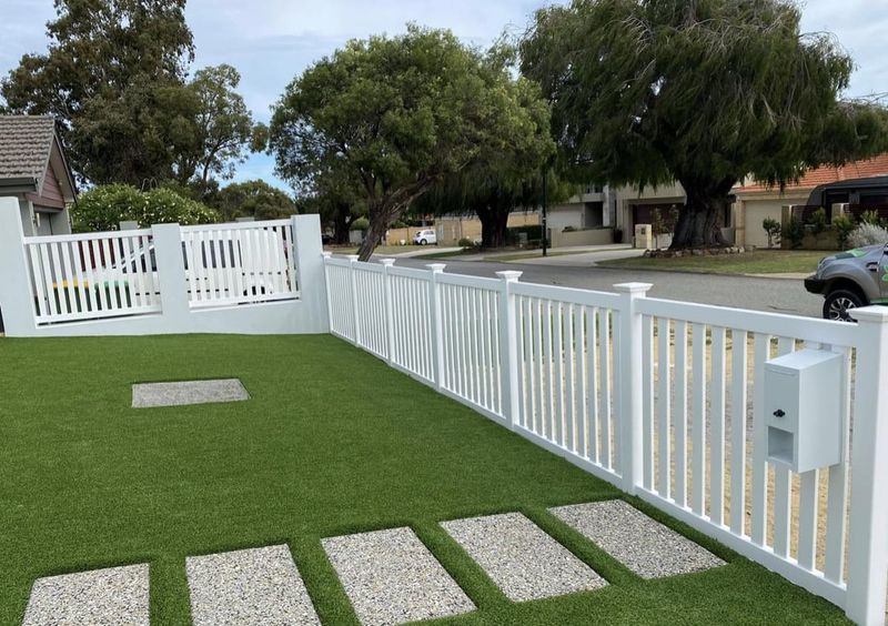
The vinyl picket fence attempting to masquerade as painted wood fools no one with its too-perfect uniformity and slightly shiny finish. These synthetic alternatives lack the subtle variations and weathering patterns that give authentic materials their character.
Exposure to UV rays eventually causes color shifts and brittleness that can’t be refreshed with paint like natural materials. The perfect uniformity signals mass production rather than craftsmanship.
If traditional wood maintenance seems daunting, consider authentic alternatives like metal fencing, masonry walls, or living fences of carefully selected hedges. These options age gracefully while providing boundary definition without pretending to be something they’re not.
16. Overly Complex Topiary Shapes

The front yard menagerie of animals, geometric shapes, and spirals clipped into evergreen shrubs creates a theme-park atmosphere rather than an elegant landscape. These high-maintenance features demand constant attention to maintain their forms and quickly look unkempt without regular trimming.
Many complex topiaries appear disconnected from the home’s architectural style and surrounding landscape. Design professionals favor plant selections that complement the overall aesthetic rather than creating jarring focal points.
For architectural interest, consider simpler forms like well-defined spheres or columns that provide structure without requiring the maintenance demands of elaborate shapes. These cleaner forms complement rather than dominate the landscape.
17. Synthetic Grass That Shines
The perfectly green rectangle of artificial turf gives itself away with that distinctive sheen that never appears in nature. No matter how advanced manufacturing becomes, these products still reflect light differently than living grass, creating an uncanny valley effect in the landscape.
The uniform color and texture throughout the seasons signals artificiality in regions where natural lawns respond to changing conditions. Even high-quality products eventually fade unevenly with sun exposure.
For low-maintenance alternatives, consider native groundcovers, hardscaped areas with permeable pavers, or drought-tolerant lawn alternatives like microclover or buffalo grass that provide a natural appearance with reduced resource demands.
18. Excessive Landscape Fabric Showing
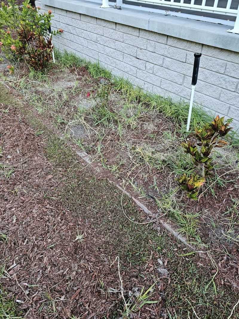
The black or gray woven material peeking out from under mulch layers immediately signals landscape corner-cutting to professional eyes. Originally installed to prevent weeds, this synthetic barrier frequently works its way to the surface, creating an unsightly industrial appearance.
Beyond the visual distraction, exposed fabric prevents natural decomposition of organic matter that would otherwise enrich soil. Plants often struggle to establish properly when roots encounter this artificial barrier.
For effective weed suppression, consider proper mulch depth (2-3 inches) refreshed annually, which naturally inhibits weeds while improving soil health. If fabric must be used, ensure complete coverage with sufficient mulch to prevent exposure.
19. Oversized House Numbers On Boulders
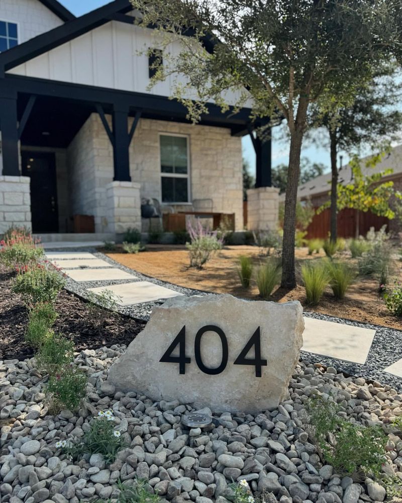
The massive boulder with giant painted or mounted numerals creates a disproportionate focal point that overwhelms the landscape. These supersized identifiers often appear disconnected from the home’s architectural style and landscape design language.
The scale frequently feels out of balance with other elements, drawing excessive attention to what should be a functional but integrated feature. Professional designers prefer address solutions that complement rather than dominate the entry experience.
Consider house numbers appropriately sized and mounted on the home itself or incorporated into lighting features, mailboxes, or entry columns that relate to the overall design scheme. The goal is identification that enhances rather than distracts.